goth kid
date released
description
lessons learned
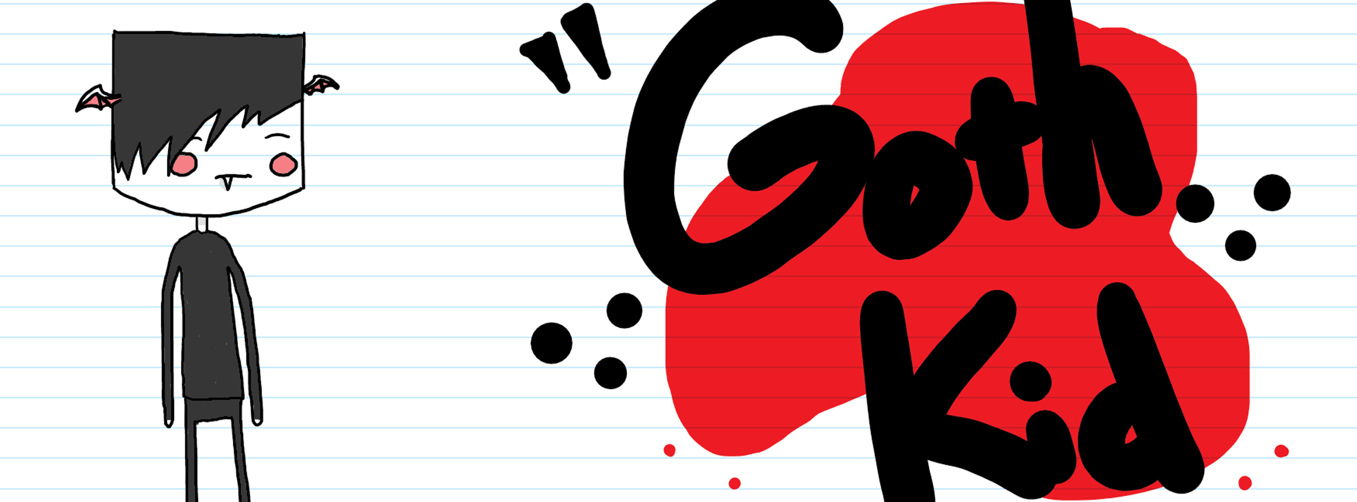
creating the lights in this game was quite an interesting challenge. at first, I was using a 32x1 sprite and creating a series of objects from the light to the next floor that it came in contact with, but that caused a lot of frame rate issues since I was generating hundreds of objects per light.
thanks to some googling, I found out that I could create an object pool and reuse a bunch of pre-generated objects when I needed them. this helped a bit, but once I added around 15 lights, the framerate issues persisted since I was still activating/deactivating up to hundreds of objects at once.
finally, I decided to figure out the space between the light and the next floor and stretch the object's sprite until it hit the next floor. this finally solved the problem and taught me how to scale on the fly and how to use object pools (which I now use all of the time).

little bombs
date released
description
lessons learned
the lessons I learned here mostly had nothing to do with development, but I still learned one major development skill that I'm beginning to finetune more and more everyday: organizing large projects. I learned very quickly that every object name needs to tell me exactlywhat the object is or what the object does.
most of the other skills I learned were design-focused. I learned a lot about designing objects, tiles and characters with pixels (as well as animating each). Some user experience (UX) details showed up once I started curating this project for a public playtest since I wanted users to be able to keep playing the game without any interruptions from me. the whole menu flow is the main part of the UX that I focused on here. there are still a few steps that I would like to revamp, but that's the beauty of an ongoing project... I can just focus on that one day and I'll get it done.
I've also begun to scratch the surface on breaking myself out of my shell with this project since I've had to network with numerous people and companies for various reasons. I've also had the chance to talk with people who played my game during the public playtest, which was a very cool experience since everyone had some type of friendly comments about the game. I'm currently in the process of submitting to Boston Festival of Independent Games to showcase this game, but we will see how that process turns out!